Share Your Team Logos

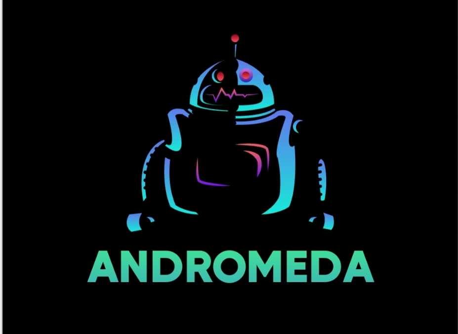
Increase the font size, get rid of the textures, get rid of the Word Art duplicated text layer x drop shadow. Your logo is straight on but your text looks like it is slightly isometric viewed from below and to the right. This creates a confusing perspective.

Be careful with the 2 gradients of the bolt on the gradient of the green backing. So many gradients and textures.

Try drawing your logo in only 2 colors and simplify to focus on shapes.

We can work with yellow and blue but you have a gradient yellow on your logo that goes from bright to mustard, and no gradient on your test, so it looks super imposed.

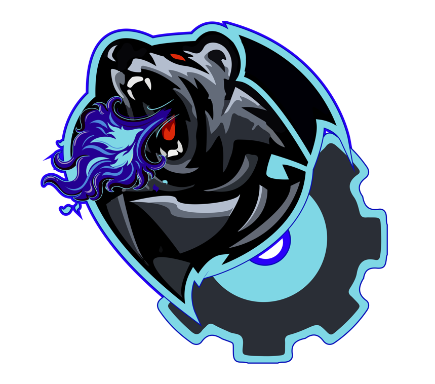
Your school logo is excellent, but the gear distracts. Also, why are cyber thing gear powered? MechaStangs could be a gear, but Cyber should be something electronic in nature.

You could also toy with abandoning the gear and go full on coat of arms / battle banner with your logo.

Edit: also…

@99904W
Lets see more motion with these inspiration pictures.

image

Whoosh is a great team name. Make your logo demonstrate the woosh.

Update here’s is the final logo:
image

i prefer the og one wit hthe black text

Concept/acting design


Team name and logo change!
Don’t mind the white line on the side…


Here’s one that I was told looks less ominous.

New logos for Team Virus:

image

My teams logo that i drew up for world’s last season. We had one, but the old one needed to be revamped

Our old logo from last year. Probably going to change it this year

We updated our logo from last year to this much cleaner one

Honestly the best logo I’ve seen so far

Thanks, it took forever to make

I am really unimaginative and don’t wanna clog up the forum with a new topic.

What ideas do you have for a logo for my team, The Dysfunctional?

Make a good logo, scribble it out then make a significantly better or worse one next to it.
I can’t pitch on the logo substance though

That’s the issue, we can’t come up with a logo. Also, nobody on my team can draw, we are all art disasters.