dw i miss when musk was just the funny rocket man too
I too like EDM.
Your font, geometric midground focus, and organic textural background seem at odds. Lose one of them, as they all seem to disagree and they all command attention.
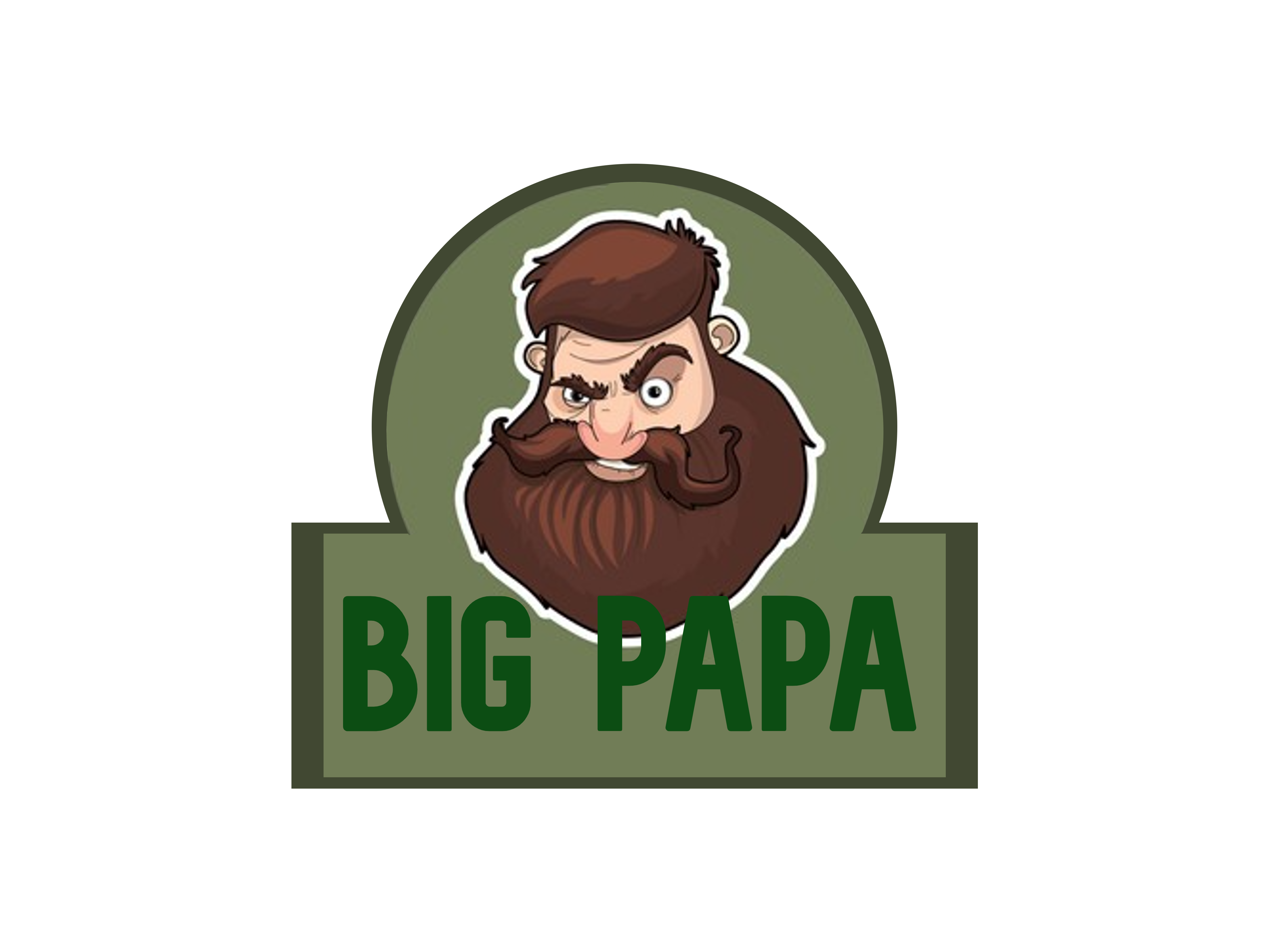
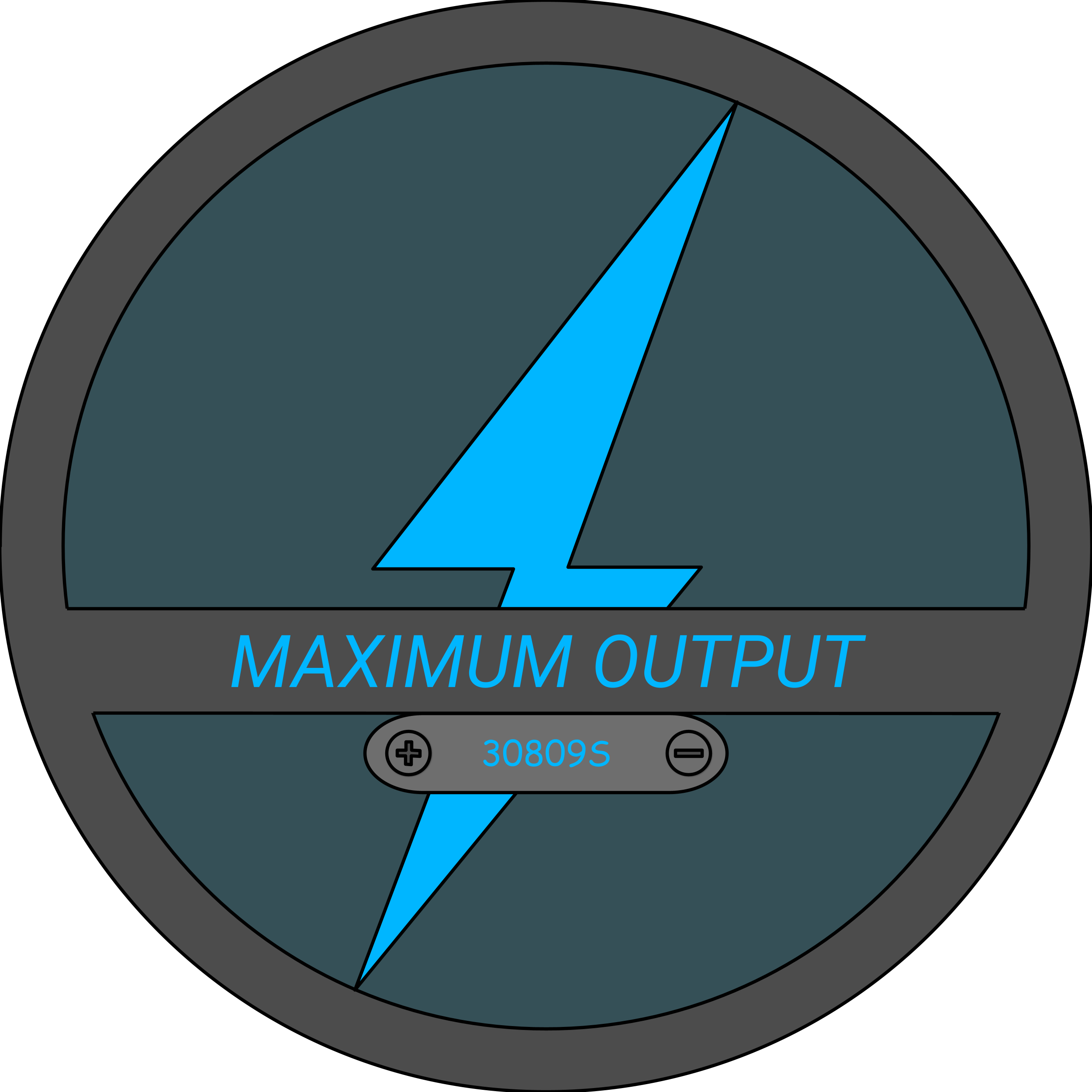
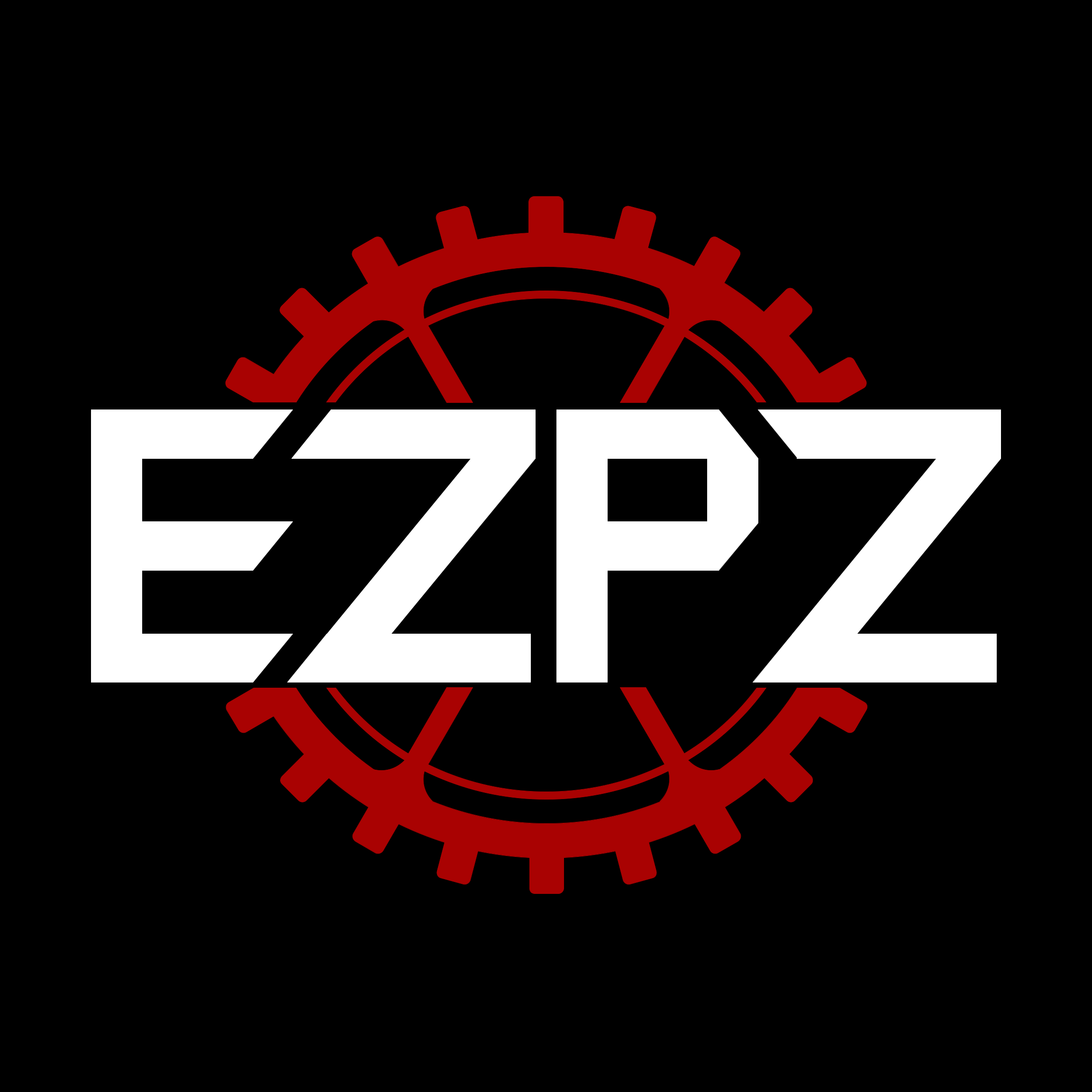
This is the logo we have for our team. It is a simple design that didn’t take long to perfect. It is easy to remake and strikes fear into the hearts of our opponents
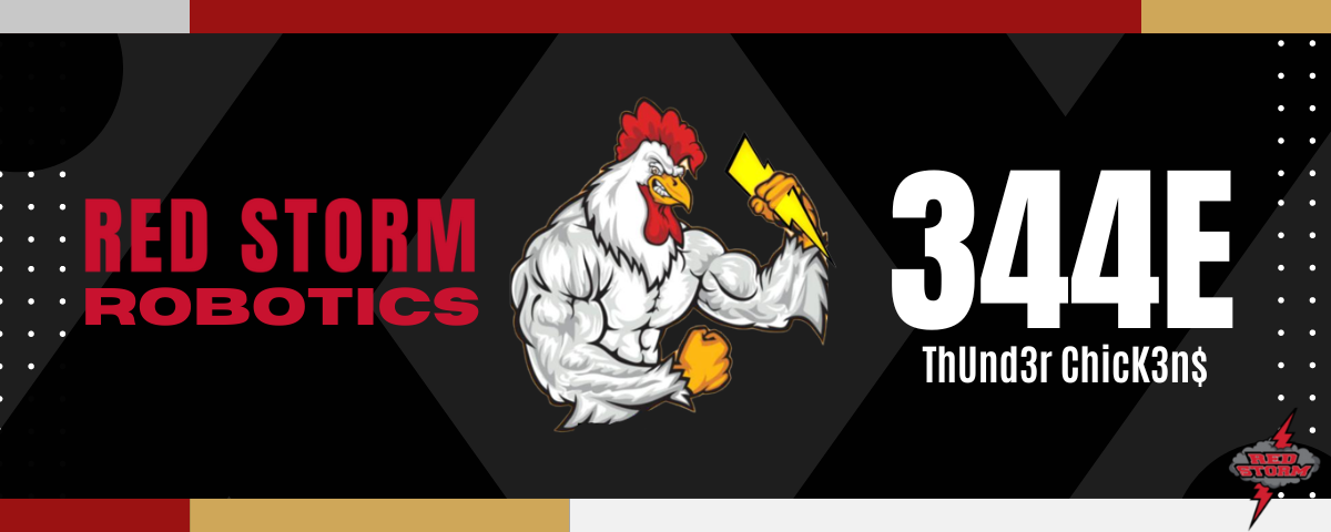
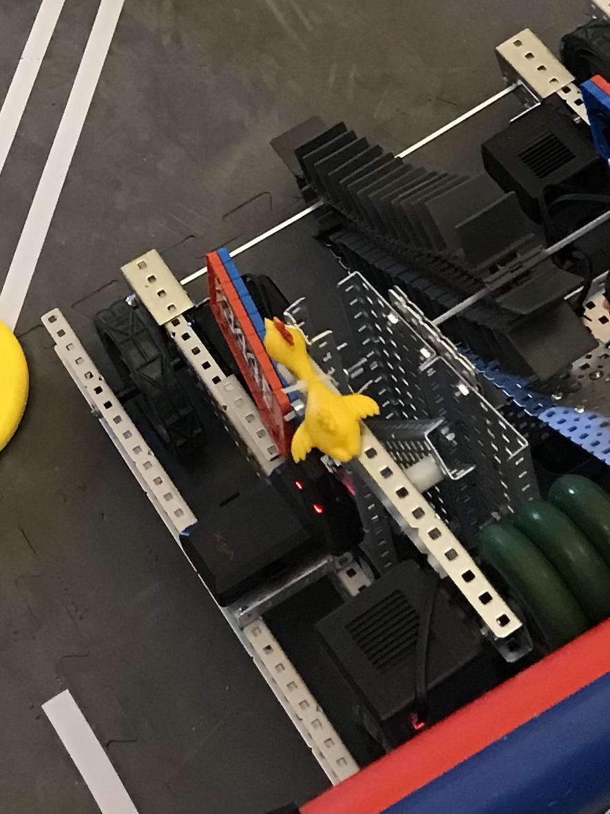
imagine you go up to the field and you look at our competitor’s robot and all you see is the jacked chicken.
|
You already know youve lost.
|
|
There is no point.


It looks like a hand to me. Cool design.
Love the message! How does it relate to your team and organization?
I would suggest bringing in team number to the design - otherwise, it is clever, but generic.
EZPZ is a vexu team so their number is in the logo
We are a Vex U team, so EZPZ actually is our “number.” We were trying to limit the number of colors in the logo due to funding issues with multiple colors on shirts. The original design was with a yellow gear acting as both a gear and a lemon, but some team members wanted to get away from the lemon idea, I personally just dislike the color yellow, so we finalized it as Garnet on Black, which is also our school color.
Had not thought about VEXU designs - yours is visually bold, precise, and clever. Apologies for the generic comment in my earlier post, I get hung up on gears…