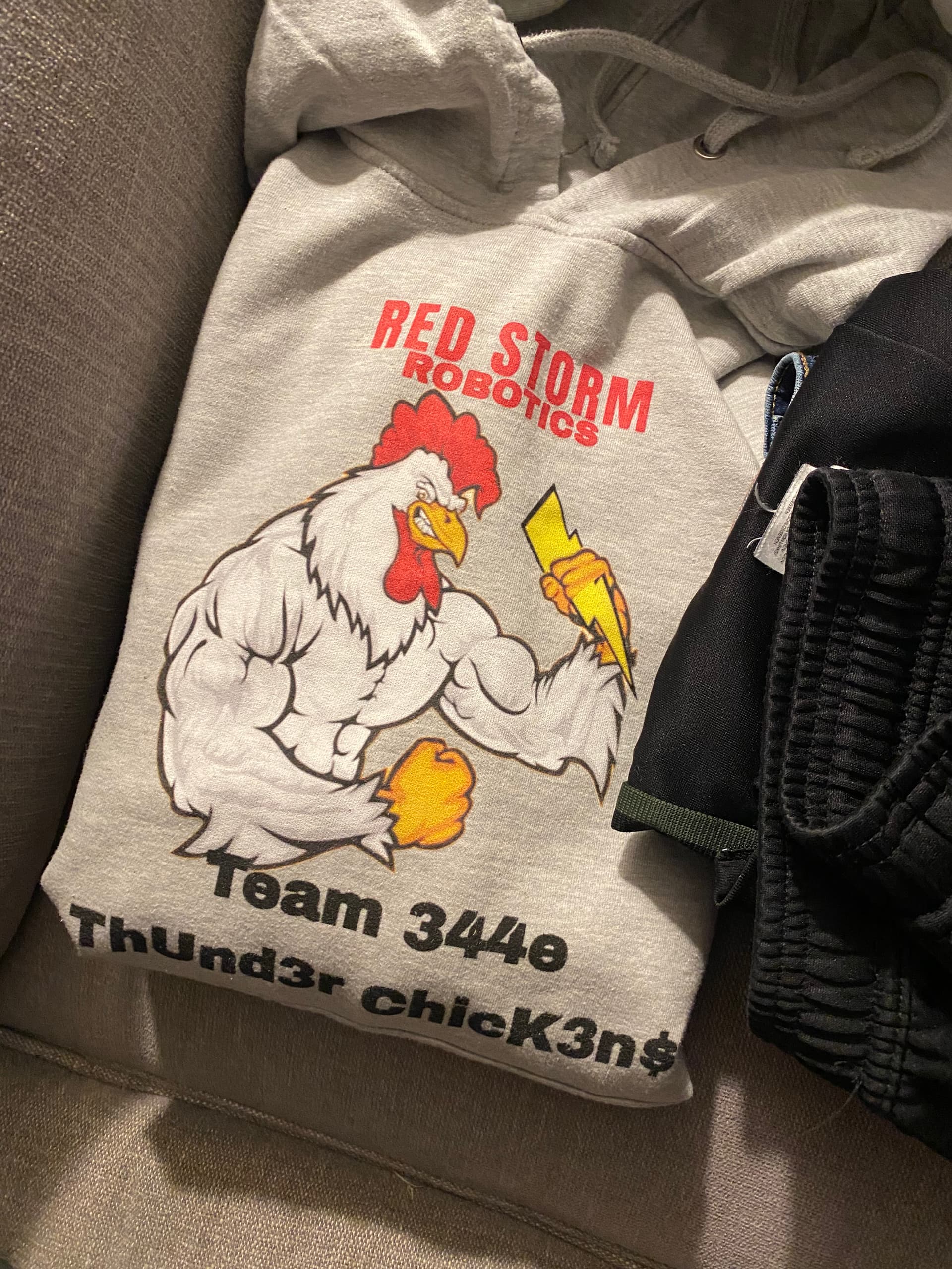
I don’t have one any idea our robot name is Zipties and out organizing name is agsi
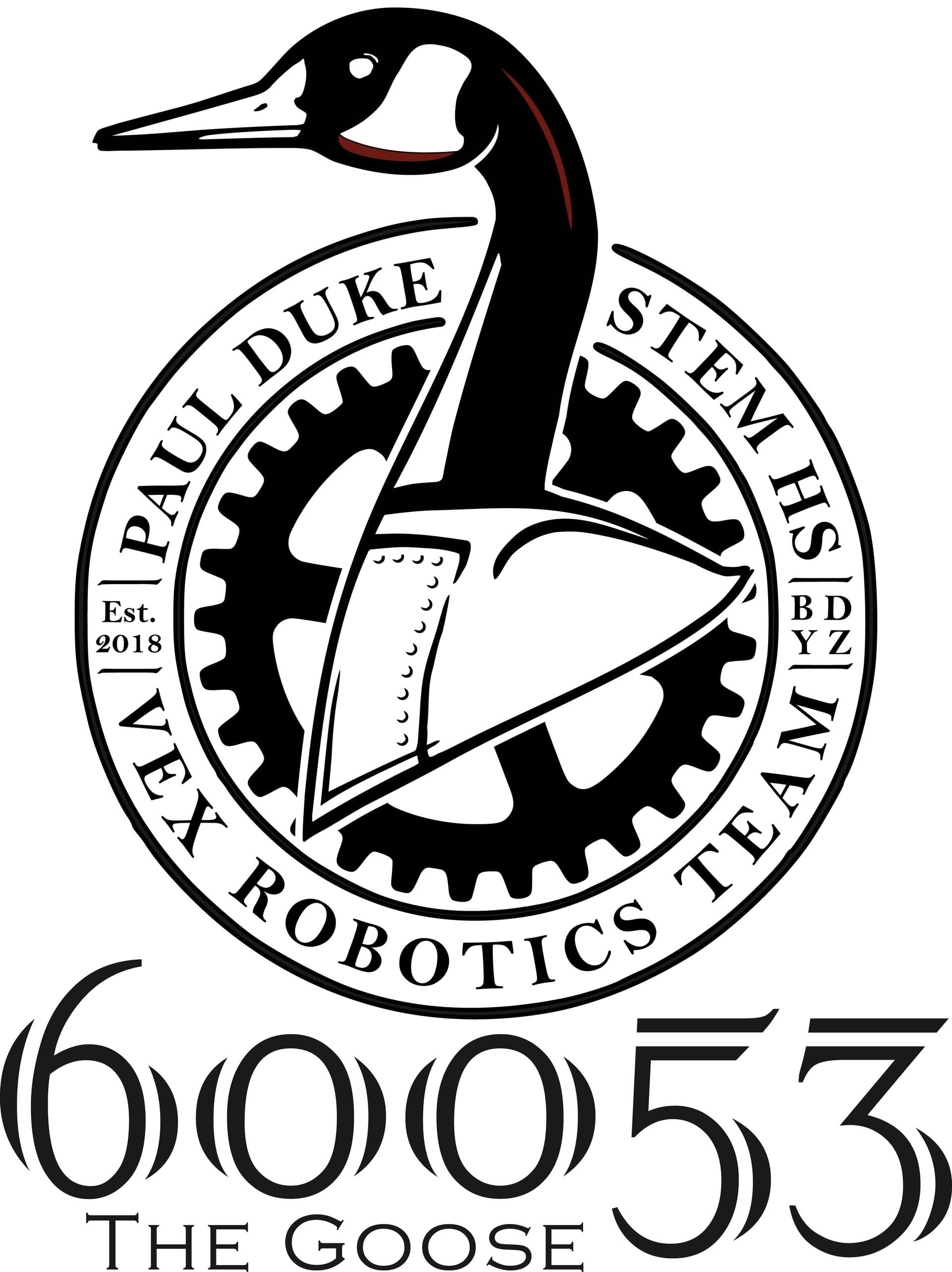
Love the imagery! I suggest putting your team number on there somewhere. Great logo!
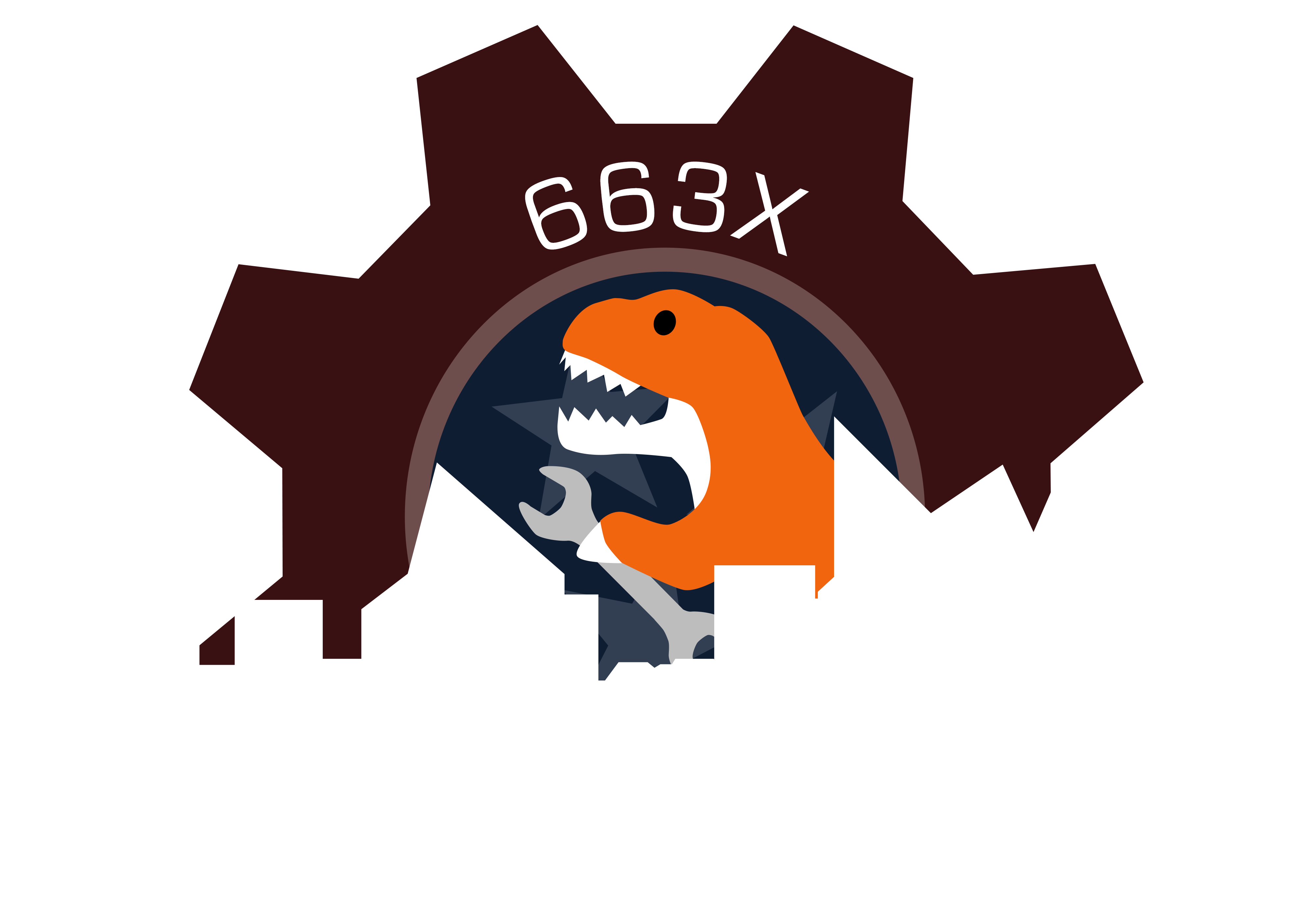
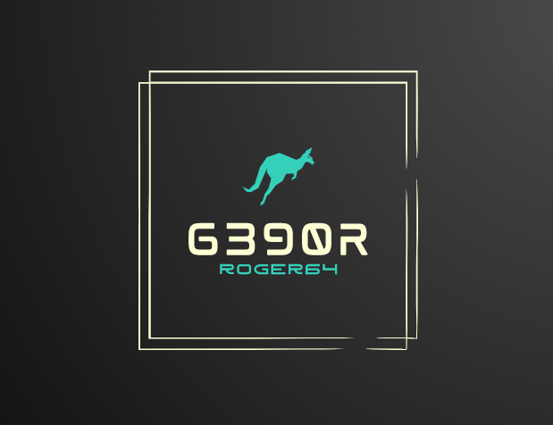
Possible logo for my team, Roger64 (all first-years)
What AI generated image website/application de you use.

why do I have a feeling that your from vinci
This logo is trying to be two or three logos stacked on top of each other. The skyline uses an outlined silhouette, the gear has stars in the middle, and for some reason there is a dinosaur stuck on the gear, in front of the stars. It seems that lots of parts of this are fighting for function.
Make the dino the center of the gear, instead of the white stars.
Next decide whether or not the skyline should participate in the gear, or be the focal point. Try eliminating the gear, and turning the dino into a silhouette as well, possibly with a gear around it, or put the skyline inside the gear, with the dino behind it. That creates a central logo shape (gear/circle) with a dino/skyline as the mascot. For simplicity, I would advise reducing the dino to fit with the artistic scheme of the gear or of the silhouette/outlined city.